Posts

Professional Article Review

The overall article was about how graphic design is and how the rules apply to how we work in the graphic design field. The main key elements are that we, as graphic designers, must learn how to work with rules but also be creative and get out there and "dare to be different"(Bosler). The authors claim is that rules are important but not all the time, sometimes it depends n the rule. Bolser talks about taking risks and staying open to ideas. The evidence that support them are that Bolser said "Breaking the rules is not for the meek designer or timid client. it takes guts." and "You have to learn the rules before you can break them." Both of those quotes speak to me because it shows the importance of breaking rules. The author weakness was that the article was overall boring. The authors strength was that she knew the topic she was writing about and had good evidence to support her claims. The authors general conclusion is that graphic designers need to get...
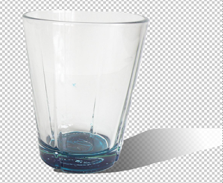
Shadow

Image

Final Motif

Image

professional article review

The main idea of the article was to make their workers happier, have more free time, and make them feel like they can cover something that are interested in. The authors argument is that when the writers had more time and could write what they were interested in the performed better. The author supported this argument by using examples. The article had weaknesses that had to do with the content. It didn't cover and explain enough information about the overall argument. The strength this article had was that it had good word choice. The authors general conclusion is that when they provided more freedom the writers performed better at work. Overall i didn't really enjoy this article just because of how it was written. The articles main point did work with the evidence that was shown. The evidence shown did have a convincing concept and it does convince me of the point they are trying to get across. I think this ties back to what i'm doing in ecomm because it shows us that you...

A day in the life of a graphic designer; Professional Article Review

In the article i read it talked about how a graphic designer lives an everyday life with graphic design and how he views his work field. The blog talks about how graphic design runs the world. It managed to show his everyday hour to hour life style. I didn't really personally like the blog post all that much. It had a lot of space for improvement. It could have focused more on graphic design. It did good with focusing on what his everyday lifestyle was though. Also the author didn't really have an argument it was mostly just facts and information about him. The author was good with interviewing the graphic designer and getting the cold hard details. The weakness the author faced was that they didn't share an personal content. When i clicked on this article i thought i would get to read about a lifestyle and that's exactly what i got nothing more, nothing less. The authors general conclusion was that graphic design has a part in everyone's life but even more so his l...

Back to school?!

Image
This week in graphic design we worked on getting back into the flow of things. We were instructed to make a pencil and a pencil holder by following step by step instructions. It was really just using different shapes and tools on illustrator. We used different shapes like rectangles, triangles, rounded squares and circles. The overall idea of this was to make a simple pencil and pencil holder.  Once we were finished with that we were instructed to make the pencil our own and add a little something to it. I decided to make my pencil purple. I made the middle part of the pencil a different shade to give it more of a 3-D affect. I added a "love letter" and a heart to add more of a story behind what the pencil was doing. After we were finished with that we were told to create something with illustrator that wasn't a pencil.  After a little bit of thinking i decided to go with a book. I made two books. One is on it's side and the other is showing a front view of ...

Review; video about Michaela

Image
8/20/15 While in class we were shown a video about a feature on a girl named Michaela who did weight lifting. The overall main idea of this video was that there was a feature on Michaela. The video started out in her house, talking to her and her mom. Then it showed some b-roll. It shows her lifting the weights. The story was about a girl named Michaela would wasn't your average teenage girl. She lifts weight for sport with her dad a her trainer. The story was told by showing her doing what she loves and talking to her family about their thoughts. We were then instructed to go through and storyboard the first 18 shots of the video. We drew what we saw on the screen, talked a little bit about what kinda shot it was and how it could be improved. My process while making the storyboard was to focus on the minor details. It was harder to determine what the types of shots were. The person that created this feature kinda bent the rules. When we would see an over the shoulder shot it ...